
Photographs of craft often fall toward one of two extremes. They are either so uncontrolled that the work becomes difficult to understand, or so polished that every trace of process and place disappears. Useful documentation sits between those positions. It provides enough order to see clearly while preserving evidence that a real object was made in a real environment.
Decide what the pictures must do
A photograph for a technical archive has a different responsibility than an opening image for a publication. Before moving lights or furniture, define the set: an establishing view, a clear full object, important details, evidence of scale, process, and a portrait if people are central to the story. A simple shot list protects against returning with ten beautiful variations of the same angle and no useful overview.
We also identify where the images will live. A wide website banner needs room for text and a crop that survives smaller screens. A vertical editorial page rewards a different composition. Product information may require neutral color and repeatable perspective. Knowing these uses does not eliminate spontaneity; it creates a dependable base from which observation can happen.
Shape available light first
Workshops already contain meaningful light: windows, task lamps, open doors, and reflections from pale walls or timber. Instead of replacing that character, begin by turning off competing fixtures and studying the existing direction. A diffusion panel can soften a hard window. A dark cloth can subtract an unwanted reflection. A white card can return enough light to separate a shadow edge.
Supplemental light should have a clear role. One controlled source placed in relation to the existing window is often more believable than several lights filling every shadow. Darkness is not missing information when the essential form remains legible. It can locate the object in its environment and keep attention where it belongs.
Let hands explain scale and sequence
Process images are strongest when the action is genuine. Ask the maker to continue a familiar operation rather than stage an unfamiliar gesture for the camera. Observe the cycle first: where the hands begin, where the tool pauses, when shavings clear, and which angle shows contact between tool and material. Then choose the moment that explains the operation.
Hands also give scale, but they deserve the same care as faces. Watch finger placement, tension, and tool safety. A technically impossible grip weakens trust even if the frame looks dramatic. Short directions—repeat that pass, hold at the end, shift slightly toward the light—usually preserve more authenticity than constructing the action from scratch.
Show the object in layers
Begin with the relationship between the object and its space. Move closer for overall proportion, then closer again for joinery, surface, hardware, or signs of use. Keep a few anchors consistent across the sequence so viewers can understand where details belong. Perspective correction can be appropriate for architecture and flat work, but removing every optical cue may make an object feel diagrammatic.
For reflective surfaces, change the environment reflected in the object rather than trying to erase highlights later. Large cards and dark flags shape metal, glass, and polished finish by controlling what those surfaces see. This approach preserves edge quality and material character.
Edit for continuity, not spectacle
A coherent set can include quiet frames. During editing, look for a rhythm: context, action, pause, detail, completed work. Repeated dramatic images compete with one another, while a sequence of varied distances lets the viewer build understanding. Color and contrast should connect the set without flattening differences between daylight, task light, and exterior conditions.
Retouching should remove temporary distractions—sensor dust, a safety label that became an accidental focal point, or a small blemish introduced in capture—not rewrite the construction. Leave the grain, tool marks, repaired wall, and ordinary signs that locate the work in the world.
Archive what the final layout cannot hold
Delivered selections are only part of good documentation. Files should carry descriptive names, capture date, creator and usage information, and enough resolution for likely future needs. Keep a broader edited archive beyond the immediate website or publication crop. Years later, process frames and contextual views may explain the practice better than the original hero image.
Prepare the space without erasing it
Preparation is valuable when it removes accidents that misrepresent the work. We clear unrelated packaging, confirm safety equipment, clean the object, and decide which active tools belong in frame. But a workshop should not be converted into a generic showroom. Useful wear on a bench, racks built by the maker, current material, and ordinary storage explain how the practice operates.
Before moving anything, make a few reference frames. They protect against over-styling and may reveal that the strongest composition already exists. If an area must be simplified, remove elements in stages and review the frame after each change. Empty space should support the subject, not make the place feel abandoned.
Plan around a real working day
Photography can disrupt production if it ignores sequence. Discuss which operations are time-sensitive, noisy, dusty, repetitive, or impossible to reverse. Capture clean overall views before sawdust enters the air, then move toward active processes. If glue-up has a short open time, the maker’s concentration and safety take priority over camera position. Some actions are better documented during a separate sample demonstration.
A schedule should include pauses for moving lights, changing batteries, backing up files, and allowing the space to return to work. It should also identify who can approve object placement, personal appearance, and sensitive background information. A calm set produces more honest gestures than a rushed demand to repeat every action.
Photograph surfaces for reproduction
Texture depends on the angle between light, surface, and camera. Raking light reveals plane tracks, woven fiber, engraving, and subtle relief; frontal light suppresses them. Neither is automatically correct. We make a descriptive frame that communicates overall color and form, then a more directional detail where surface is the subject.
Color-critical objects require a consistent reference and a calibrated workflow. Even then, viewers use uncalibrated screens and printed pieces shift by stock and ink. The aim is defensible consistency, not a claim of perfect universal color. Avoid local adjustments that make one image impressive while causing the sequence to contradict itself.
Include people with context and consent
A portrait at work should communicate relationship, not reduce a person to visual atmosphere. Explain intended uses, confirm how names and roles will appear, and provide a reasonable opportunity to flag frames that create a safety or dignity concern. For client workplaces, obtain permission before including visitors, addresses, confidential drawings, or screens.
Environmental portraits benefit from a simple activity, but the activity should belong to the subject. Ask where they naturally pause, inspect, sharpen, sketch, or speak with collaborators. Photograph those transitions as well as direct concentration. The resulting set shows a practice rather than a costume.
Create files for several lifetimes
The same capture may need to serve an immediate website, a printed case study, a grant application, a press request, and an archive. Preserve high-resolution masters, create consistent derivatives, and avoid overwriting original captures. Store captions, names, locations, permissions, and credit requirements beside the files rather than in someone’s memory.
Filename systems should be readable outside a specialist application. A project code, date, subject, sequence, and version can be enough. Back up in more than one location and verify that backups open. When licensing is limited, encode the restriction in metadata and the delivery notes so a future user does not mistake possession for unlimited rights.
Know when not to photograph
Some moments are unsafe, confidential, emotionally private, or simply better experienced without a camera. A complete story does not require access to everything. Agree on boundaries before the day and make it easy for anyone present to pause capture. Trust is more valuable than an image obtained through pressure.
Restraint also applies during selection. A technically strong frame can be excluded if it exposes client information, misrepresents a process, or turns an individual into a stereotype. Editing is an ethical act as well as a visual one.
Deliver a sequence that can be edited
Clients often need both immediate selections and room for later storytelling. We organize the delivery into a concise primary set, supporting details, portraits, and a broader archive. The primary set should stand on its own without forcing every channel to use the same hero frame. Variations in orientation and negative space allow designers to place titles without covering the subject or making destructive crops.
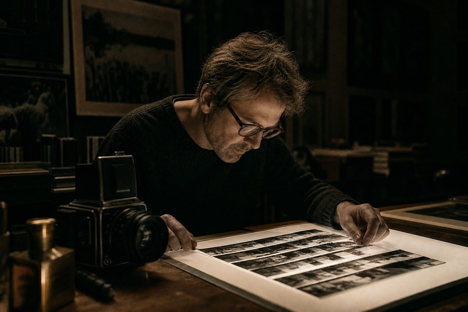
Contact sheets remain valuable even in a digital workflow. They reveal repetition, gaps, and the relationship between frames more quickly than opening files one at a time. A marked contact sheet also records why certain images were selected. When another editor revisits the work, that context supports thoughtful alternatives rather than a search based only on star ratings.
Separate documentation from promotion
One session can support both purposes, but the distinction should be explicit. Documentation prioritizes accurate construction, sequence, condition, names, and date. Promotion may use stronger cropping, atmospheric light, and concise narrative. Problems arise when a promotional frame becomes the only record of an object or when documentary authority is implied by an image that materially rearranged the scene.
We therefore protect straightforward views before pursuing more interpretive frames. Captions identify conceptual or reconstructed scenes when that distinction matters. This does not make the expressive photographs less legitimate; it keeps their purpose honest and preserves information for conservators, fabricators, editors, and future owners.
Review on the final surfaces
An image judged on a large calibrated display may fail as a small mobile crop or absorb too much ink on uncoated paper. Before final delivery, test representative files in the actual layout and at intended size. Check whether dark details close up, skin and wood remain plausible, captions need more context, and essential features survive responsive cropping.
Export settings should follow use rather than habit. Web files need appropriate dimensions, compression, color profiles, and meaningful alternative text supplied alongside them. Print files may need larger resolution and a workflow agreed with the printer. Keeping masters separate from derivatives avoids repeated compression and lets future formats be made from the best available source.
The goal is not to make every workshop look cinematic. It is to reveal why this work, this person, and this place have their particular character. Control serves that truth; it should never polish it away.