
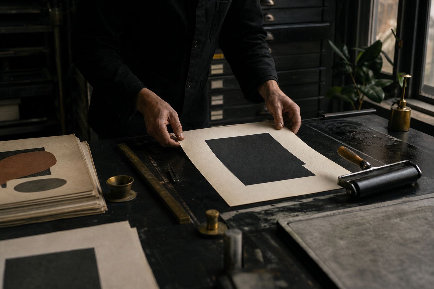
Patina is often described as a surface effect: brass darkens, leather softens, paint gathers small marks, and a tabletop records years of use. But the deeper appeal of patina is evidence. It shows that an object can absorb time without losing its identity. Visual systems can do something similar when they are designed for use rather than frozen for launch day.
A system is handled, not displayed
Brand presentations tend to show ideal conditions: the exact image crop, generous whitespace, perfect copy length, and a carefully controlled sequence. Daily communication is less obedient. A program title runs long. A partner logo appears. A volunteer makes a flyer. A social platform changes its format. If the identity survives only in ideal compositions, it is a picture of a system rather than a working one.
Furniture offers a useful comparison. A chair is evaluated not only by its silhouette but by what happens where the hand grips it, how the joint responds to repeated load, and whether its finish can be renewed. Likewise, an identity should be evaluated at its pressure points: small sizes, low-cost printing, unfamiliar contributors, urgent messages, and repeated editions.
Design variation with boundaries
Patina is not random damage. It accumulates in relation to material and use. A visual identity also needs bounded variation. A typographic system might permit several scales but hold a stable relationship between headline and supporting information. A color family might change by season while maintaining contrast standards. A flexible frame might accept many image ratios while keeping captions and credits in a consistent place.
These boundaries should be easy to perceive. If every choice requires reopening a long manual, the system will be bypassed. We prefer a small set of rules that can be demonstrated in actual templates: one alignment logic, a practical type hierarchy, clear color roles, and examples of what happens when content grows.
Materials change the message
A mark printed in one ink on uncoated stock does not communicate in the same way as that mark rendered in polished foil. Production is not a final application layer; it is part of the identity’s voice. Paper tooth, ink density, binding, screen brightness, motion, and accessibility settings all influence how the system is experienced.
For cultural and craft organizations, we often begin with available production rather than an abstract effect. What can the local printer reproduce consistently? Which paper is obtainable in small quantities? Can a one-color version retain its character? Does the web type load responsibly and remain readable when it does not? These constraints create specificity rather than diminish it.
Maintenance is part of authorship
An identity can become brittle when every later adjustment is treated as corruption. Organizations change, and systems should include ways to add a program, retire a message, or correct an inaccessible color pairing. A short maintenance rhythm—a yearly template review, organized source files, named type styles, and an owner for approvals—protects coherence without turning the original designer into a permanent gatekeeper.
Versioning matters too. Instead of allowing dozens of almost-identical files to circulate, a shared source and a clear archive preserve both current use and institutional history. The goal is not spotless uniformity. It is understandable continuity.
Signs of productive wear
Over time, users may discover a crop, phrase, or combination that was not anticipated but fits the underlying logic. Those adaptations can become part of the system. The designer’s task is to distinguish productive wear from loss of function. If a variation strengthens recognition and remains accessible, document it. If it creates confusion, repair the rule or template that allowed it.
Build tools, not just examples
A beautiful launch set can hide a fragile system. Templates expose whether the identity can actually work. We test common documents with ordinary content: an event with six partners, a report with dense tables, a social announcement written at short notice, an email viewed with images disabled, and a sign that must be read at distance. The exercise converts aesthetic intentions into usable decisions.
Good templates separate fixed relationships from editable content. They provide sensible defaults without locking every artifact into one composition. Named paragraph styles, accessible color tokens, image guidance, export presets, and plain-language notes save more time than an elaborate brand book that nobody can search. The best handoff lets a new contributor make a competent first piece without guessing at hidden designer preferences.
Accessibility strengthens recognition
Contrast, type size, reading order, captions, and motion controls are sometimes treated as restrictions applied after creative work. They are better understood as durability requirements. A pale signature color that disappears on screen is not truly a dependable brand asset. A display typeface that cannot support the organization’s languages is not a complete voice. A motion behavior that obscures navigation under reduced-motion settings is not robust.
We test core combinations against current accessibility guidance and in imperfect conditions: a dim projector, a bright phone screen, grayscale printing, keyboard navigation, zoom, and missing web fonts. These tests often sharpen the identity. They reveal which few relationships carry recognition when decorative effects are removed.
Language gathers patina too
Visual identity is inseparable from repeated language. Labels, calls to action, credits, dates, and small operational phrases become familiar touchpoints. A voice system should therefore include more than campaign headlines. It should show how the organization welcomes, instructs, apologizes, asks for support, and describes uncertainty.
Instead of prescribing a fictional personality through a long list of adjectives, we collect real sentences, edit them, and identify repeatable principles. Perhaps titles are direct while supporting text is generous. Perhaps technical terms are kept but immediately explained. As these patterns are used by different writers, the voice develops recognizable wear without becoming a script.
Plan for succession
Organizations outlive software subscriptions, staff roles, and sometimes the studios that designed for them. Durable identity work accounts for this. Final files should use documented formats, distinguish licensed assets from owned ones, include font and image rights, and identify which elements can be recreated if a service disappears. A simple inventory prevents a future team from learning these boundaries through legal or production mistakes.
Training should include at least one real working session rather than a presentation alone. Watching users complete an artifact exposes ambiguous template controls and missing decisions. Their questions become improvements to the system. This is the visual equivalent of easing a sharp edge where hands naturally land.
Measure coherence without demanding sameness
A useful review asks whether an artifact is recognizable, readable, appropriate to its audience, and connected to the wider system. It does not ask whether every margin matches an original launch example. We periodically place a year of outputs together and look for patterns. Some deviations show healthy adaptation; others reveal a rule that is misunderstood or a template that no longer fits the work.
The response should be proportionate. Correct inaccessible combinations immediately. Repair frequently repeated friction in the source template. Document successful new patterns. Leave harmless local character alone. Maintenance works best as care, not policing.
Test the system with real custodians
Before handoff, we invite the people who will maintain the identity to use it without the designer driving every choice. One person might build an event notice, another update a web page, and another prepare a partner presentation. We observe where they pause, which labels they misunderstand, and what they invent to complete the task. These moments reveal more than a polished approval meeting.
The response is not to write a rule for every possible situation. We improve the high-frequency tools, explain the few decisions with serious consequences, and establish a channel for genuinely new cases. A short recorded walkthrough can complement written guidance, especially for production tasks that depend on sequence. Source files should include examples with ordinary, imperfect content rather than only showcase copy.
Budget is part of system design
An identity that depends on premium production for every use may fail a small organization even if its launch materials are excellent. We identify where investment has lasting value and where economical methods should still feel intentional. A distinctive paper might be reserved for a yearly publication while daily notices use one-color office printing. A custom type family may be practical for a large institution, while an open, well-supported family can give a community project more independence.
This hierarchy keeps lower-cost outputs from appearing like degraded versions of the “real” brand. Each production tier receives its own considered rules. Constraints become recognizable character, and teams can choose responsibly without asking permission whenever circumstances change.
Retirement can preserve meaning
Not every element should last forever. Campaign marks, temporary programs, and outdated claims need an intentional end. Keeping them active indefinitely creates visual noise and weakens the parts that still matter. A simple deprecation record can identify what is retired, what replaces it, and whether old files remain available for historical reference.
Retirement is different from erasure. An archive of representative work helps future teams understand why the system evolved. It also prevents old assets found through search from being mistaken for current standards. Continuity becomes a documented conversation rather than a pile of undated files.
A mature identity should look inhabited. Its consistency comes from relationships, not from making every artifact identical. Like a well-kept worktable, it can carry marks of real activity while remaining dependable, recognizable, and ready for the next use.